2025 Engineering Expo
PROJECT OVERVIEW
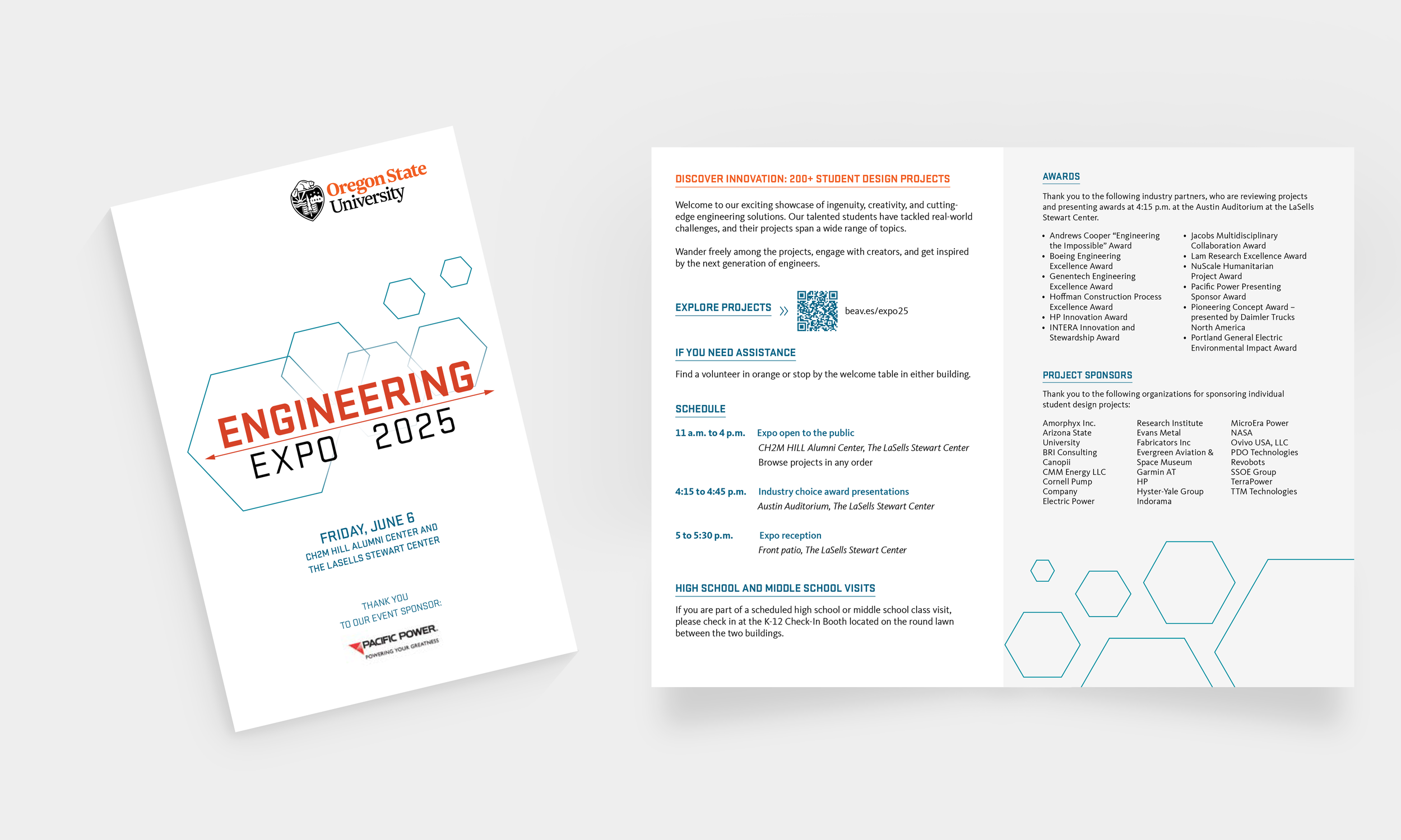
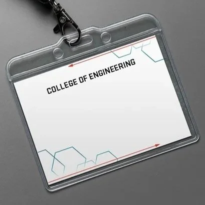
Start to finish branding design for the 2025 Engineering Expo including logo design, print, and digital marketing materials.
ROLE
Brand Identity & Logo Design
Graphic Design
PROJECT TIMELINE
January - June 2026
Logo refresh
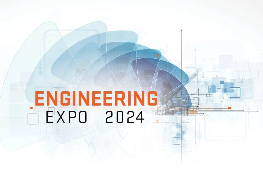
The existing design
I started my refresh with an examination of the existing graphic. While the logo was energetic and had a strong sense of movement, the execution felt a bit too busy. There were many overlapping shaped, layers transparencies, and many elements that competed visually. My goal was to preserve the dynamic wordmark while stripping back some of the noise to make it an easily recognizable graphic. With this in mind, I created simplified, dynamic logo that kept the most loveable elements while improving on others.
Redesigned Options
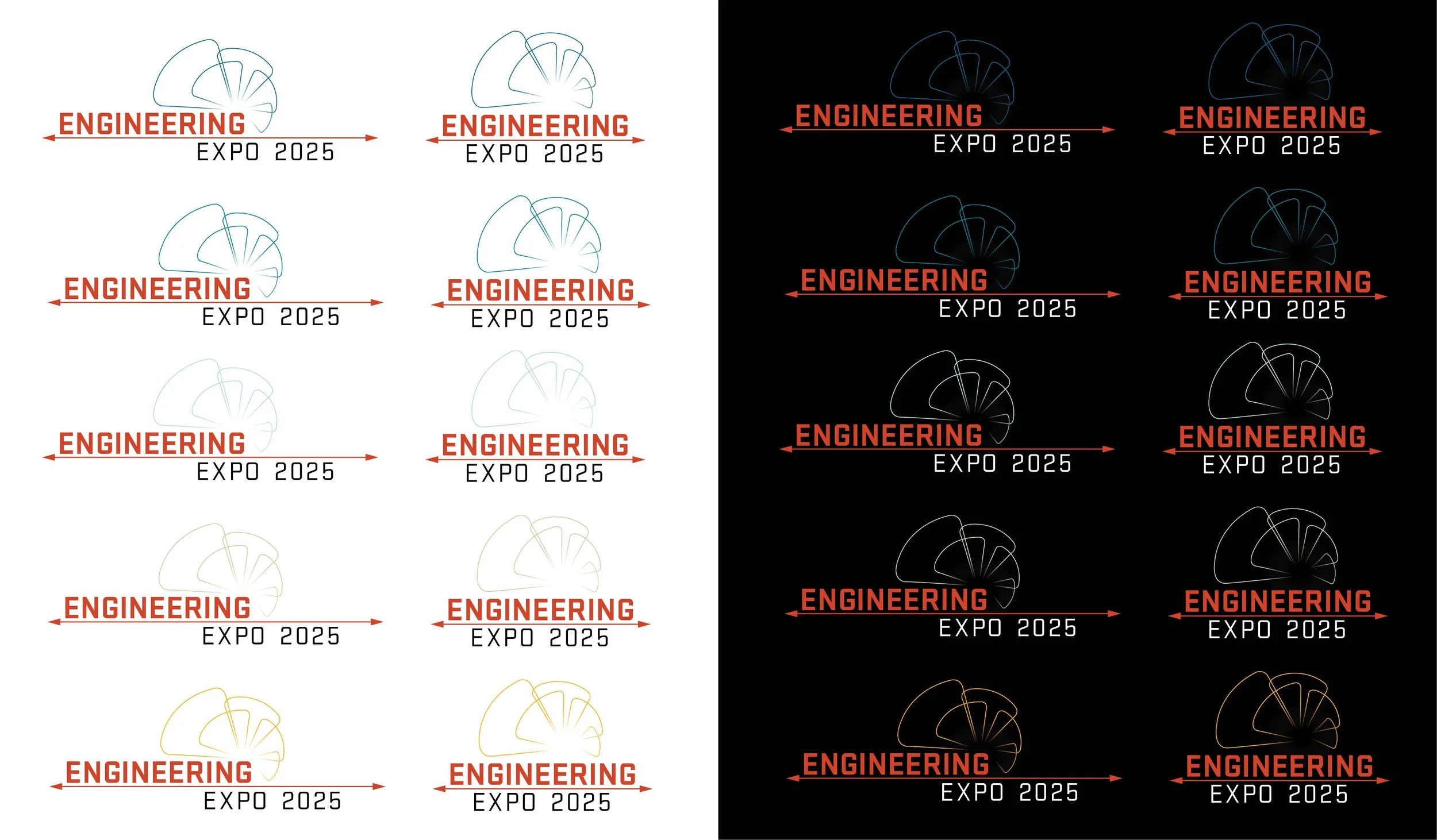
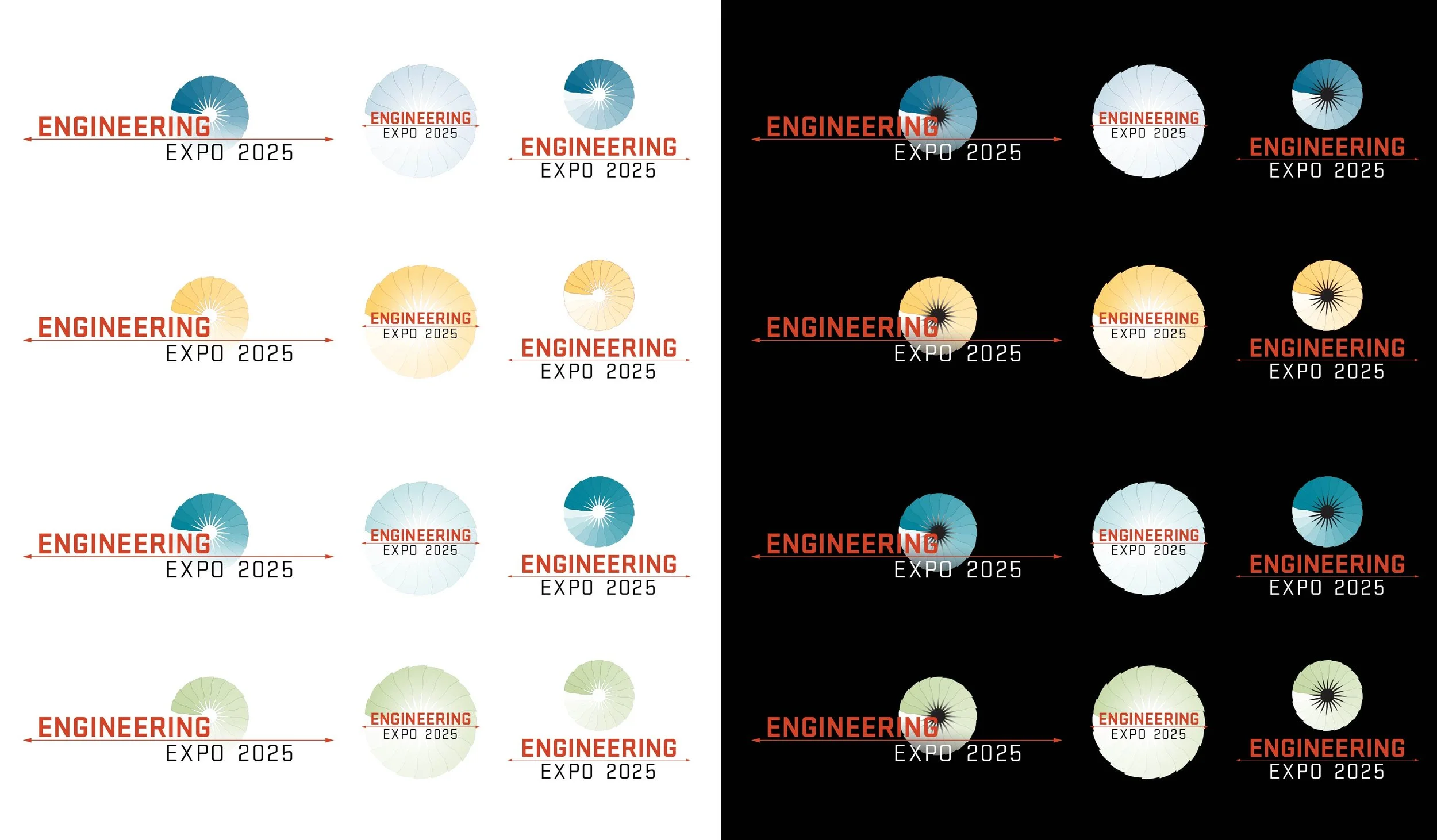
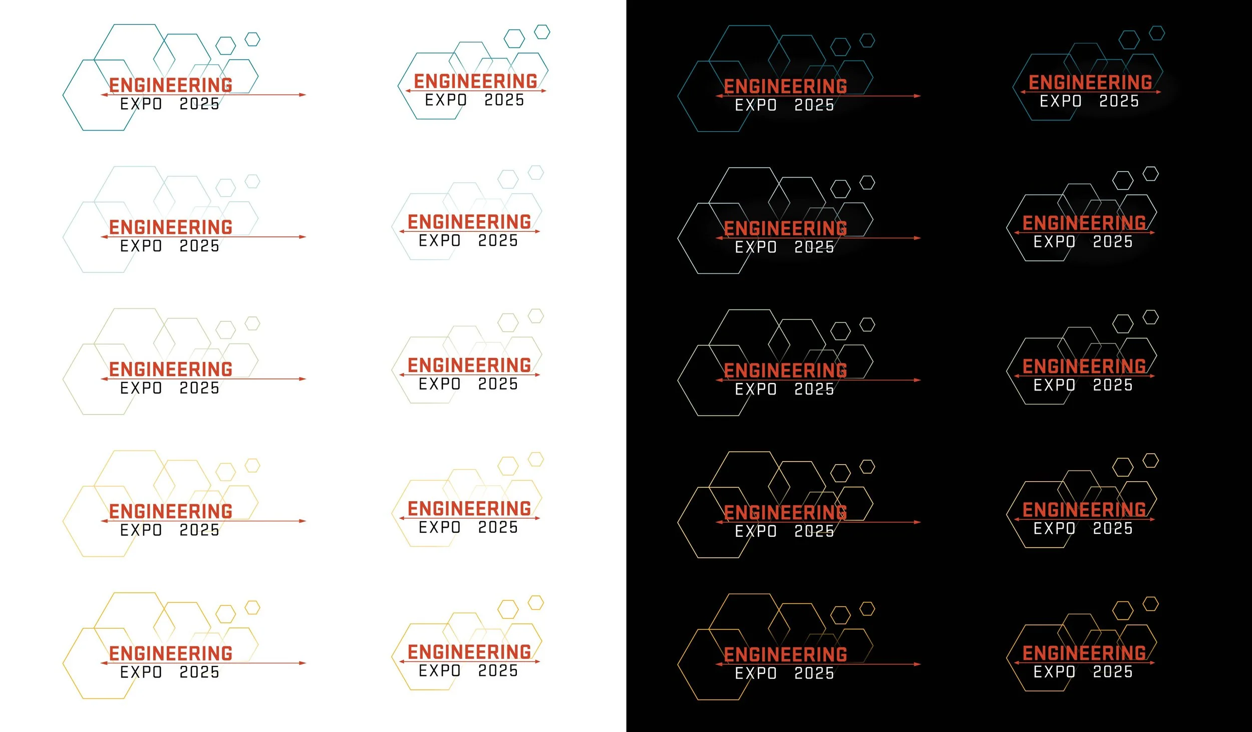
I developed and presented three graphic identity options, each a simplified iterations of the original design. Each option was displayed in both vertical and horizontal lockups to demonstrate how the identity could scale across different layouts and applications. They were also presented on white and black backgrounds to display how contrast, legibility, and visual weight shift depending on the various combinations of the brand’s color palette. With this content, I was able to then give my professional recommendation on how to proceed with selecting a final asset.
FInalized Color Palette
The selected three bold colors from OSU’s 16 color palette. The palette brings energy to the expo event through Oregon State’s primary brand colors, Beaver Orange and Paddletail Black, complemented by a fresh, timeless, and grounding shade of High Tide blue.
Selected Graphic Identity
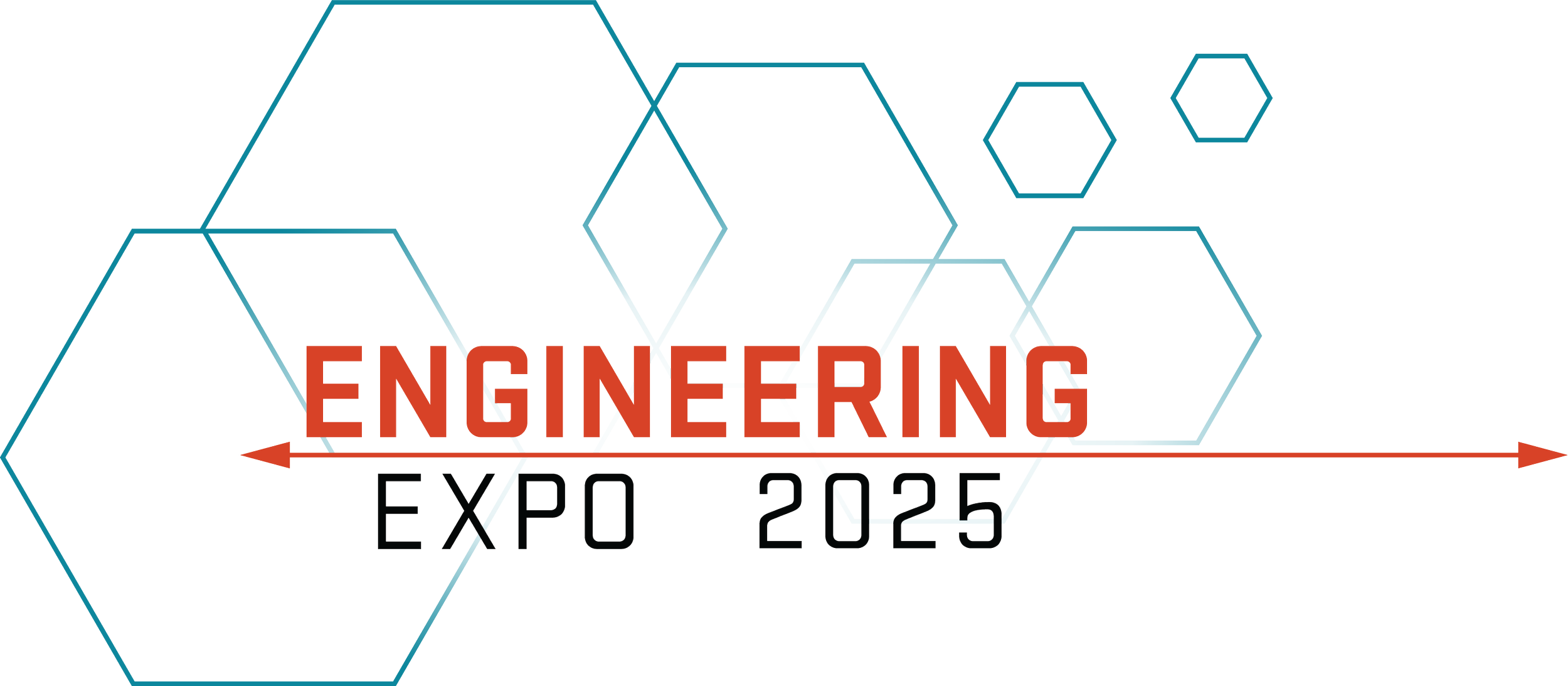
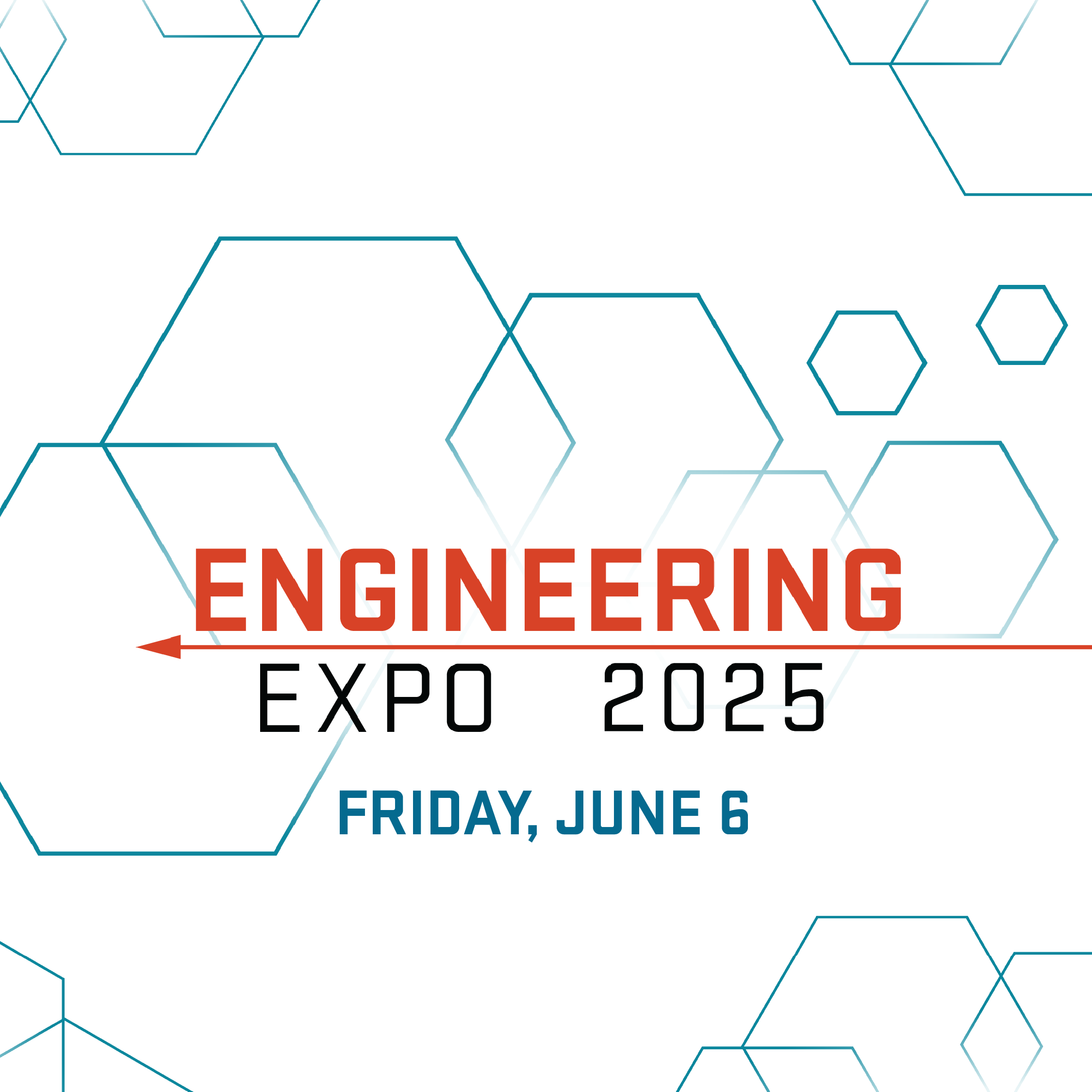
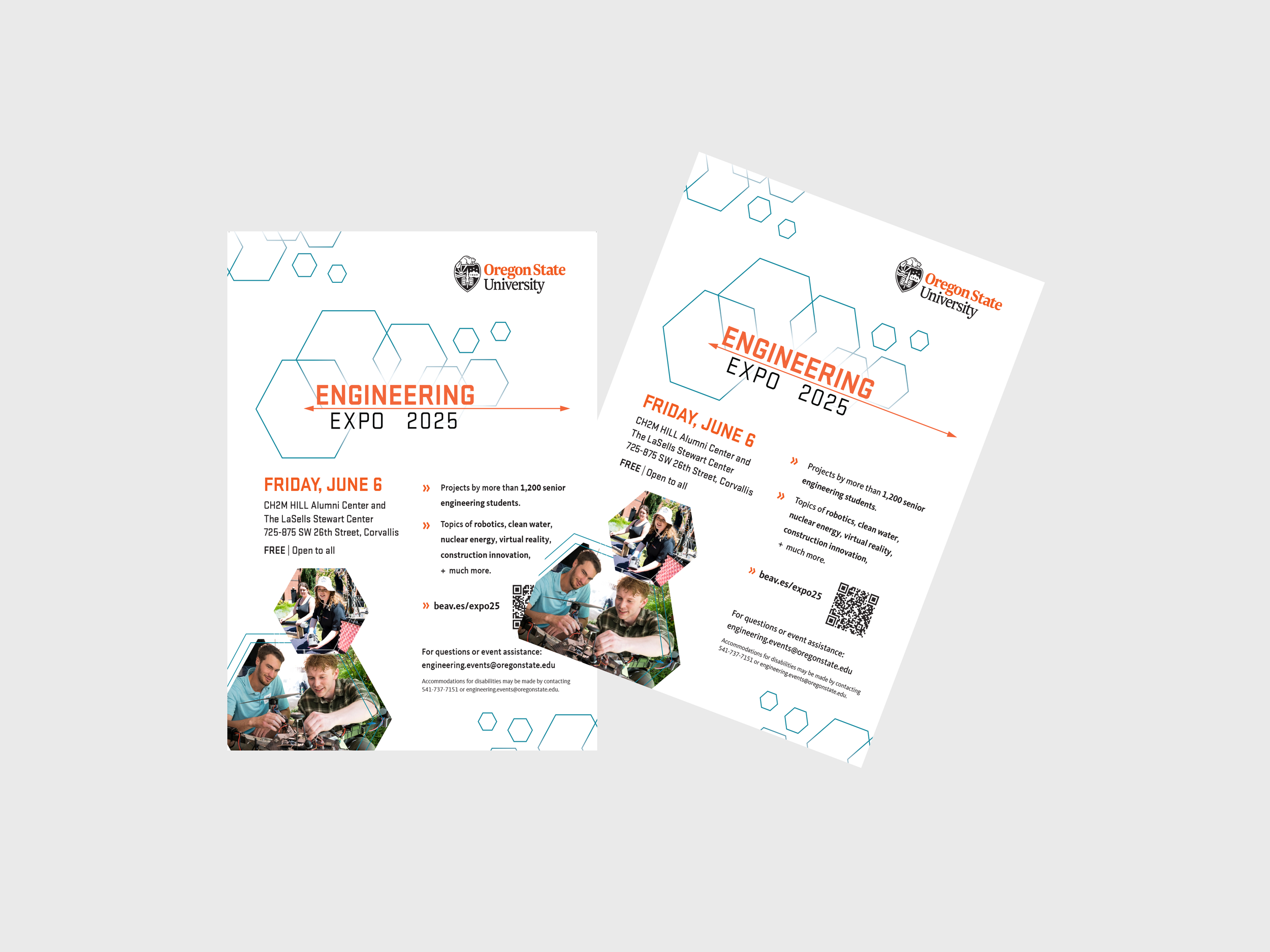
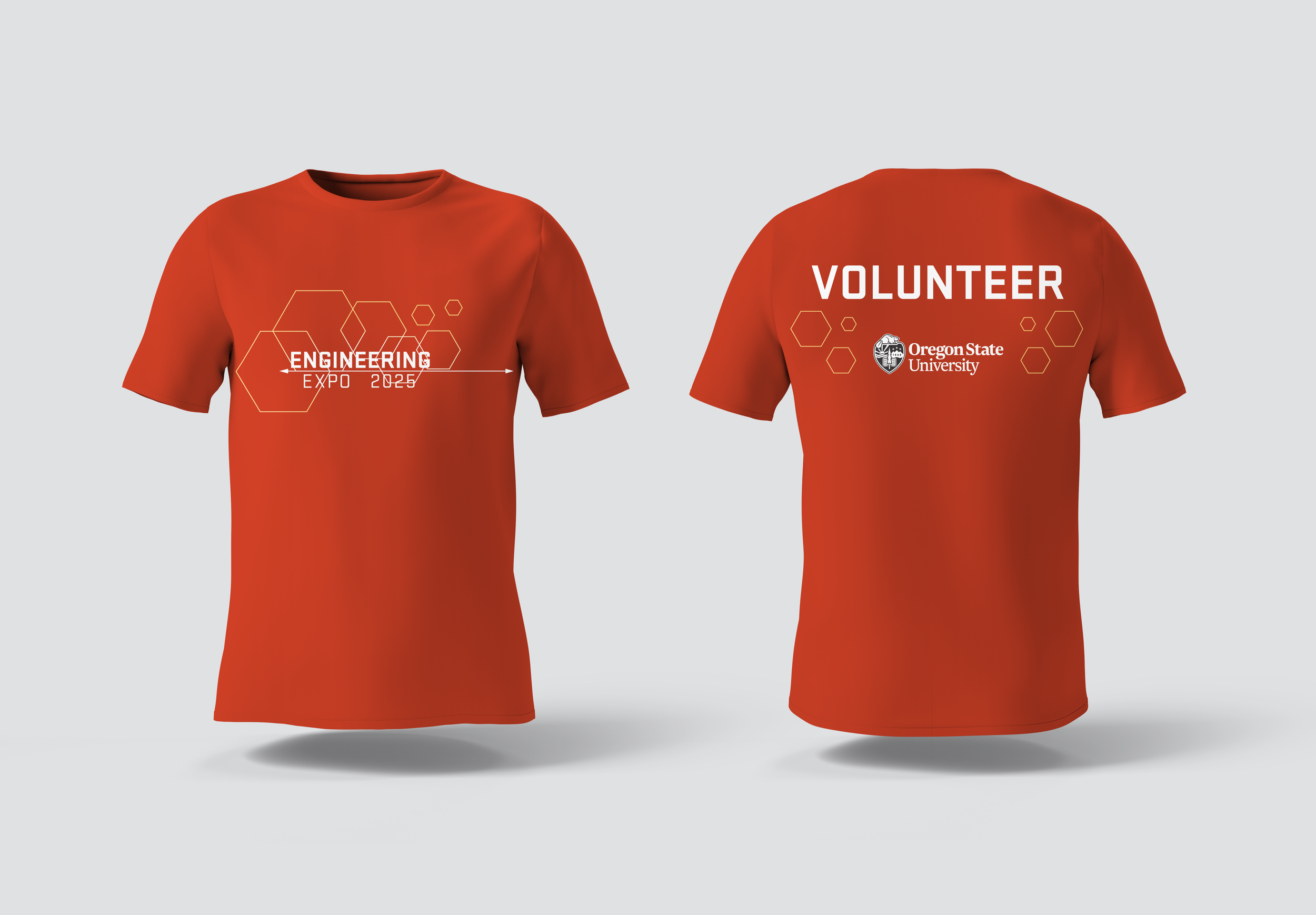
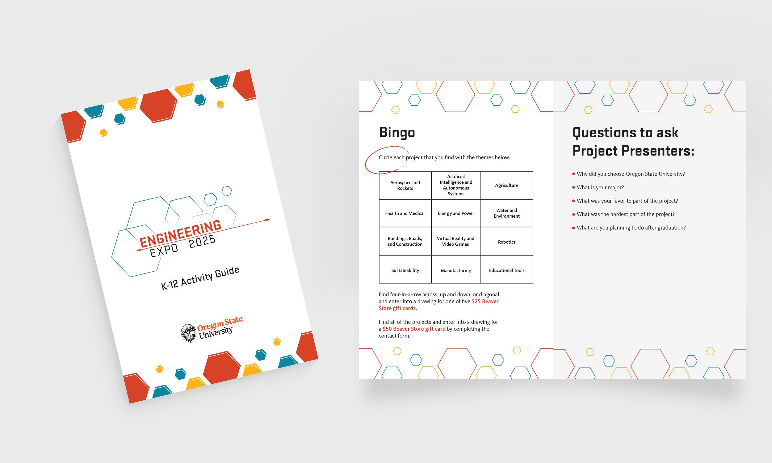
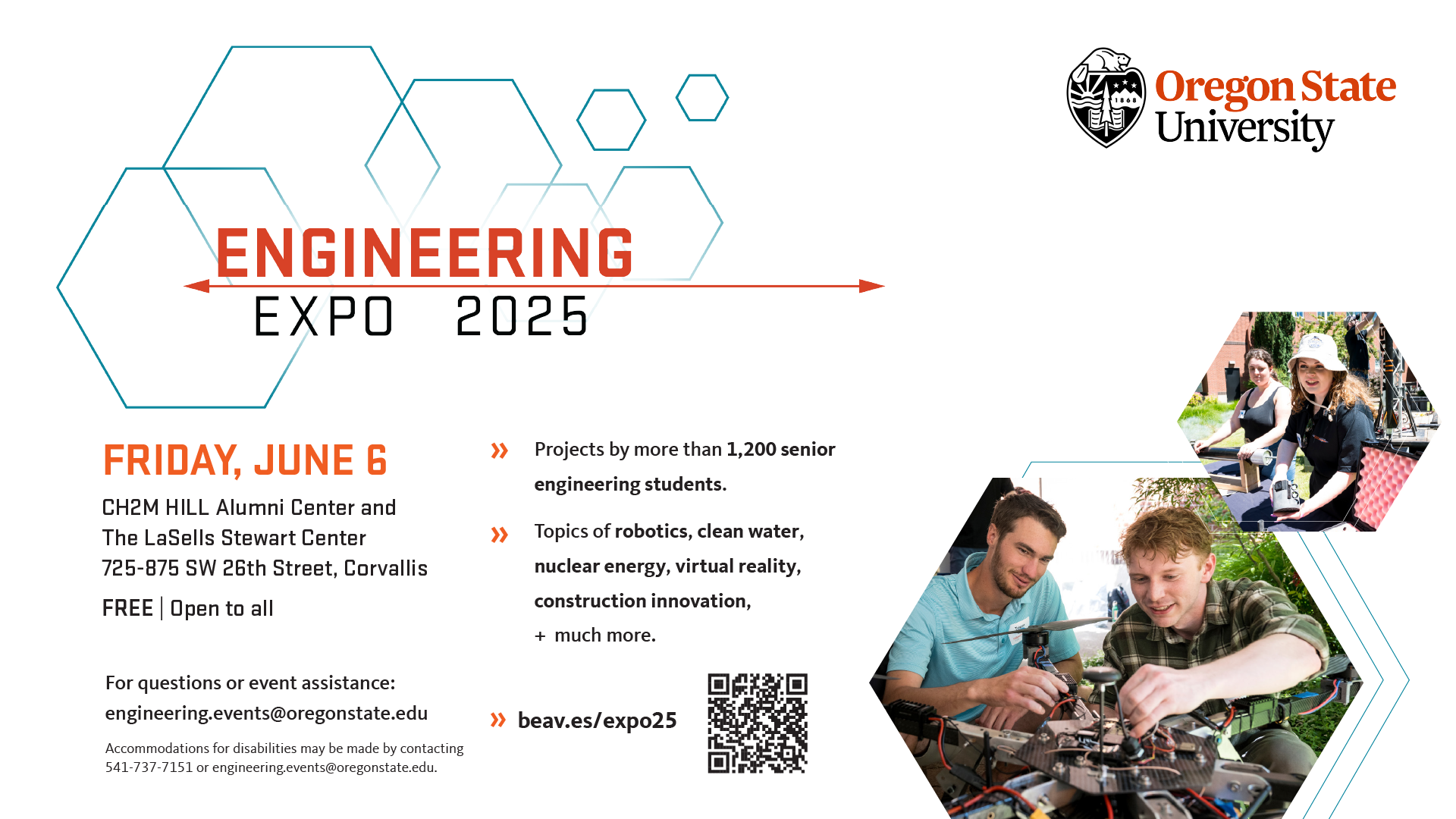
This rejuvenated design retains the core visual identity of the original through it’s directionality, movement, and fanning decorative elements but filters it into something much more cohesive. The graphic has a new level of readability without the various layers and the geometric shapes read as a deliberate elements that aren’t competing for attention. This new design honors the original’s spirit while conveying a more modern energy built to work across any application.